
Art Above Tv


For homeowners in Dyer, Crown Point, and across Northwest Indiana, the biggest mistake with art above TV is simple, the sofa gets ignored and the wall gets blamed. The room doesn't start at the studs. It starts where people sit, because the seated eye line is what keeps the screen comfortable and keeps the art from forcing the TV too high.
That's the part often missed. A living room isn't a gallery, and a TV wall isn't blank space waiting to be filled. It's a working wall, watched for long stretches, often with the whole family in the room, so the right answer has to protect comfort first and style second.
Why Your Sofa Sets the Height, Not the Wall
The usual advice says to hang art directly above the television and make it look centered. That sounds neat until the television ends up climbing the wall to satisfy the artwork instead of the people sitting on the sofa. In a room built for evening use, the sofa sets the height, not the wall.
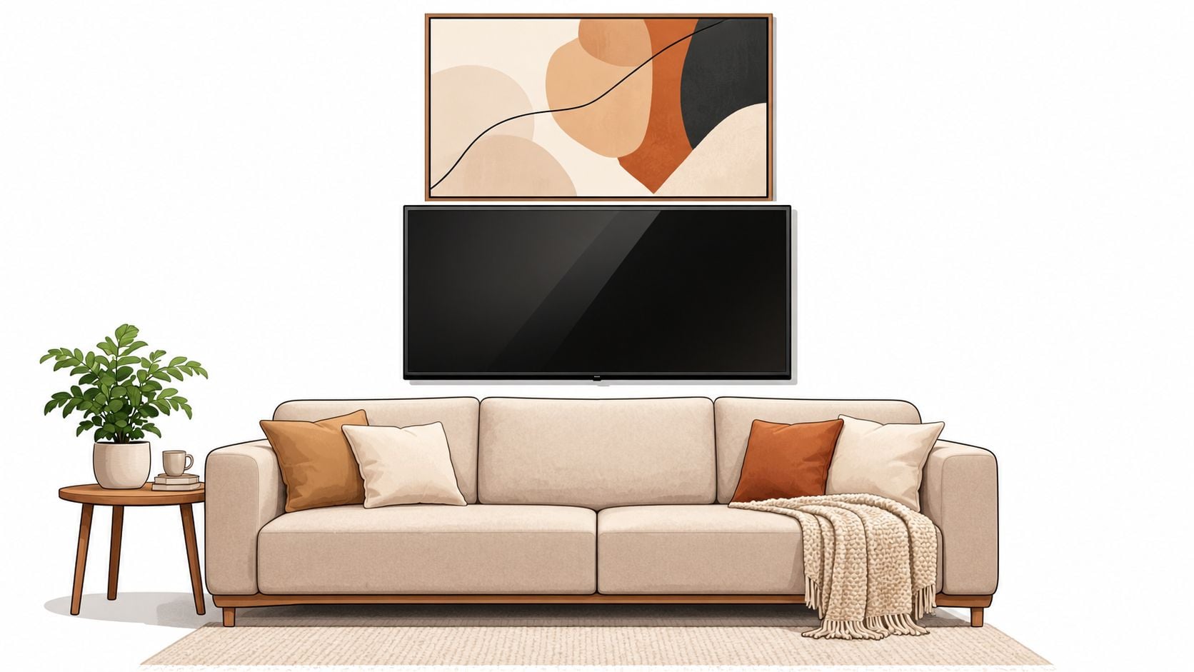
Start with seated comfort, then build upward
A screen that sits correctly for seated viewing should stay close to the room's natural sightline, because long periods of upward viewing can feel wrong fast. That's why museum-style eye-level thinking matters less than sofa-based viewing in a home. The artwork should adapt to the TV, not pull the TV higher just to satisfy a decorative rule.
Practical rule: If the art makes the TV feel like it drifted too high, the arrangement is wrong, even if the wall looks balanced in a photo.
A better approach is to treat the television as the ergonomic anchor and let the art support it. That keeps the room calm, keeps neck angle reasonable, and gives the wall a finished look without making the screen feel like it was squeezed into a decoration plan. For a useful visual reference on proportion and placement, art size and style advice gives a helpful sense of scale before any holes go in.
Groen's own placement guidance for sofas and TVs, found in this room-planning tool, fits the same idea, measure the seating first, then let everything else follow.
Measuring the Wall, the TV, and the Gap
A good art above TV layout doesn't come from guessing. It comes from measuring the screen, the seating position, and the space left over after comfort has been protected. Skip that, and the wall will look “decorated” but still feel off every time the TV turns on.
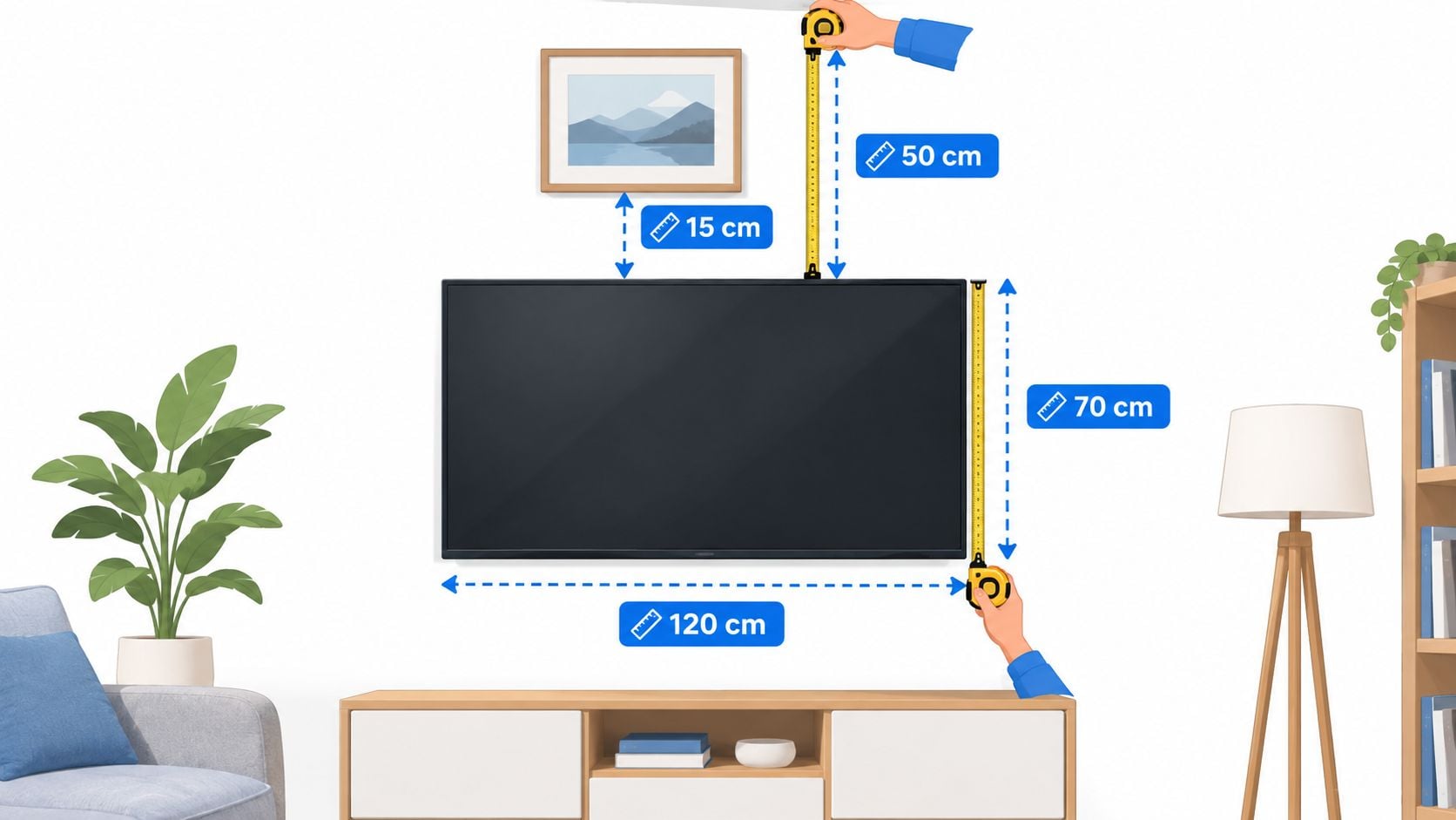
Use the sofa as the measuring point
The simplest sequence is this. First, record the TV's width, height, and top edge. Then mark the seated sightline from the primary sofa, not from standing height. After that, tape out the artwork's full outer dimensions on the wall, and check the view from the sofa, side seats, doorways, and main traffic path before anything gets drilled.
The commonly repeated 57 to 60 inch centerline idea is built for standing viewers. In a seated living room, a center closer to 55 inches or lower often reads better, because the eye naturally falls from the couch rather than from the floor. The important point is to use the center of the artwork, not the top edge, as the controlling measurement.
A narrow vertical piece may look elegant on its own, but it can feel lost above a wide screen.
That's why a horizontal work or a balanced grouping usually fits the shape of a television better than a tall, skinny frame. The screen is wide, the seating is wide, and the art should echo that proportion instead of fighting it. Groen's practical measuring page, how to measure furniture, reinforces the same showroom logic, measure the opening before committing to a shape.
A quick checklist before drilling
- Mark the TV outline first: Use painter's tape to show the exact footprint, not a guess based on the screen size alone.
- Test the artwork width visually: If the piece looks too small in tape, it'll look even smaller once it's hung.
- Keep a clear gap: Leave enough room so the art feels related to the TV, not stacked on top of it.
- Check the loaded weight: Use studs or rated hardware, because a frame that slips later ruins the whole wall.
One more point matters here. A wall that looks balanced from standing height can feel too high from the couch, so the mock-up has to be judged where the family watches.
Choosing the Right Layout for Your Wall
Once the measurements are right, layout becomes a choice about mood and proportion. Some rooms want one strong statement. Others need rhythm, movement, or a softer edge around the screen. The wrong move is picking a layout because it looks popular rather than because it suits the wall that is there.
Compare the four layouts homeowners use most
| Layout | Best Room Type | Main Strength | Key Trade-off |
|---|---|---|---|
| Single oversized horizontal piece | Minimal rooms, lower ceilings, clean-lined spaces | Strong focal point, simple and calm | Can feel heavy if the TV is already large |
| Diptych or triptych | Wide walls, longer sofas, balanced modern rooms | Adds rhythm without crowding the screen | Needs careful spacing to avoid looking scattered |
| Gallery wall around the TV | Collected, personal rooms with enough wall width | Brings personality and flexibility | Can visually swallow the television if overbuilt |
| Floating shelf with leaned frames | Casual rooms, easy-update spaces, layered décor | Easy to rotate and style | Demands clean cable and soundbar clearance |
A single piece is the safest answer when the room already has plenty going on. It gives the eye one clear place to land, and it works especially well when the screen is large and the wall needs calm, not complexity. A diptych or triptych does a better job when the wall feels wide and a single frame would look thin by comparison.
Use the room's energy, not a rulebook
A gallery wall can work beautifully, but only when the TV remains the anchor and the surrounding pieces stay in supporting roles. If every frame competes for attention, the wall starts feeling busy instead of designed. A floating shelf arrangement is more flexible, which helps when the homeowner likes to rotate framed pieces, sculptural objects, or seasonal accents.
Good rule: If the layout makes the television feel smaller without making the wall feel fuller, it's working.
For a living room-focused look at how seating and media furniture interact, living room furniture for TV is a useful companion reference. The best layout is the one that respects the sofa, the screen, and the circulation path all at once.
Frames, Colors, and Styles That Work With a TV
A television wall has to solve a visual problem the rest of the room doesn't have. The screen is large, dark, and reflective, so the art above it needs to calm the wall down, not create another competing rectangle. That's why finish and color matter as much as subject matter.
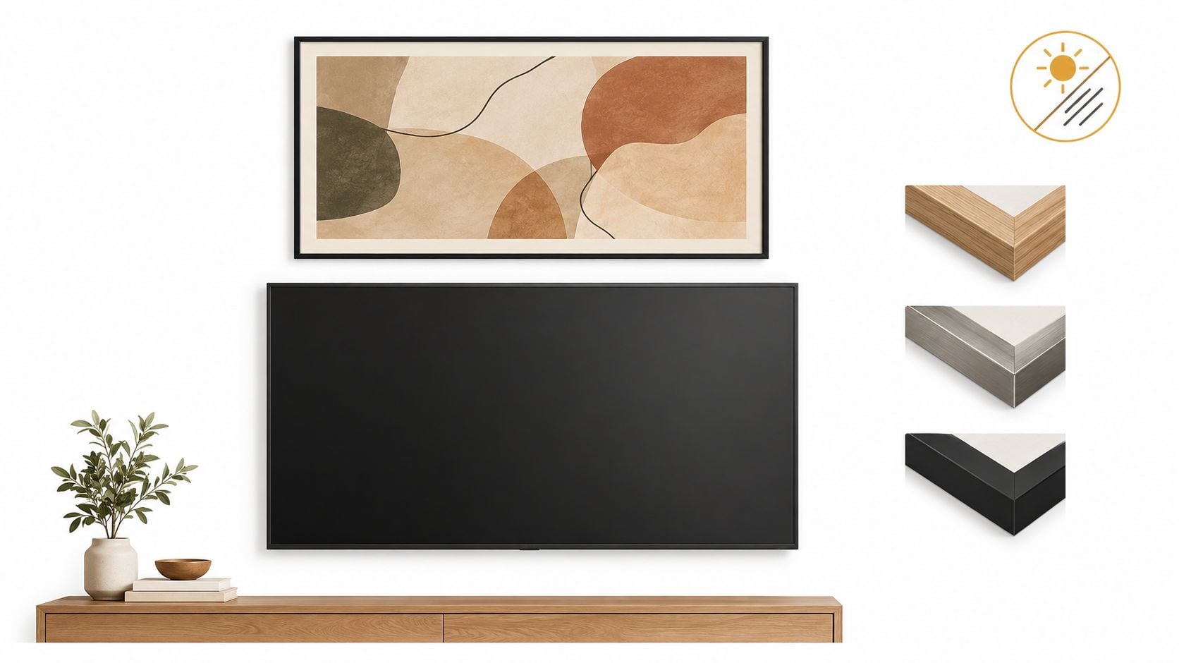
Pick frames that lower the visual noise
Matte or low-glare glazing is the obvious choice above a TV because reflections become the enemy fast. Shiny glass bounces light from windows and lamps, and that glare makes both the art and the screen harder to read. Heavy ornate frames can work in some traditional rooms, but around a flat panel they often feel theatrical in the wrong way.
The cleaner move is to echo what's already in the room. Warm wood tones from the console, side table, or nearby case goods can be repeated in the frame so the wall feels coordinated instead of assembled. If the room has built-ins or cabinetry, a framed piece that echoes those finishes usually feels settled much faster than a random statement frame.
For homeowners hanging vintage posters or printed art, conservation glazing for movie posters is a useful reminder that the frame should protect the piece without turning the wall into a mirror.
Match color story, not just style
The wrong color temperature can make a beautiful piece lose the room. Cool art beside a warm room, or a stark black-and-white print in a space that's already visually harsh, can make the wall feel disconnected. A better answer is to pull one or two tones from the rug, pillows, console finish, or drapery and repeat them in the art.
That same logic works with dimensional decor too. A wall sculpture can soften the rectangle of the television without looking like a second screen. Groen's 3-D wall sculptures fit naturally into that kind of approach when a homeowner wants texture instead of another flat frame.
The goal is simple. The art should support the screen, not argue with it.
Cables, Soundbars, Heat, and Lighting
A polished media wall can fall apart because of one ugly cord or one bad reflection. That's why the practical details matter more than most style guides admit. The wall has to work with the soundbar, the wiring, the light, and the heat coming off the equipment, not just with the paint color.
A real room problem and how it usually gets fixed
A homeowner in a typical family room might love a framed picture above the TV, then realize the soundbar sits exactly where the frame wants to hang. The fix isn't to force the frame lower and crowd the screen. It's to center the soundbar first, keep cable paths hidden through the console or wall channel, and then choose art with enough clearance that nothing feels squeezed.
Reflective glass near a bright window usually creates the next problem. By afternoon, the frame can throw back lamp glare or daylight, and that reflection competes with the screen. A matte finish or a lower-glare surface is the cleaner answer, and the taped mock-up should be checked in both daylight and evening light before any hardware goes in.
If the wall looks good only when the room is dark, the layout still isn't right.
Keep lighting calm and layered
Picture lights, sconces, and dimmable lamps can all help the wall feel finished, but they need to sit outside the screen's line of sight. Bright fixtures aimed directly at the art often cause more glare than warmth, especially when the TV is off and the wall becomes the room's main visual field. The trick is to layer ambient light around the wall, not blast it across the glass.
Hardware matters too. The frame should be anchored into studs when possible, or mounted with hardware rated for the actual loaded weight of the art. That's not a detail to save for later, because a beautiful layout that starts slipping on the wall is already a failed layout.
For homeowners choosing the furniture under the screen, how to shop for TV stands is worth reviewing before the final mounting decision, since console height affects the whole arrangement.
When Art Above the TV Is the Wrong Move
Sometimes the smartest design choice is to stop trying to force art over the screen. A low ceiling, a narrow wall, or a TV that already sits near seated eye level can make the classic formula feel crowded and awkward. In those cases, adding more above the TV usually makes the room worse, not better.
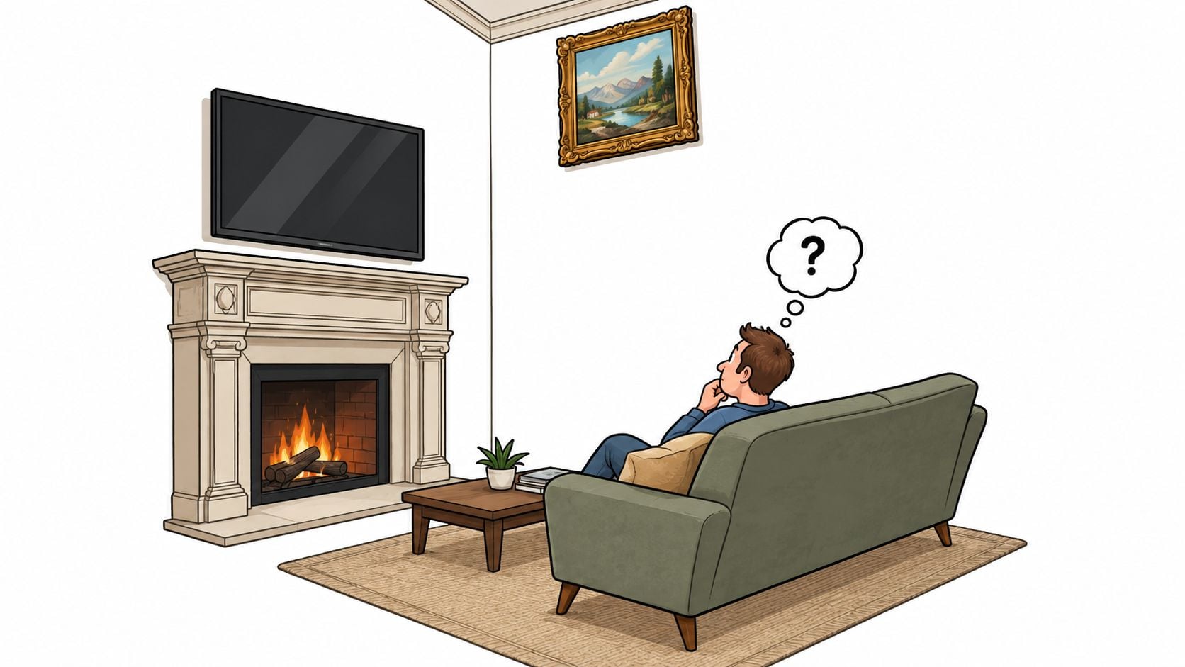
Know the warning signs
If the sofa sits close, the ceiling feels low, or the screen is already mounted at a comfortable height, the wall doesn't have room for a tall arrangement. A soundbar or console can also eat up the vertical space that art would need to breathe. Off-axis seating makes the problem worse, because a wall that looks centered from one chair can look lopsided from the rest of the room.
In those rooms, the right move may be one of three options. A single oversized horizontal piece can sit above the TV if the wall still has breathing room. A balanced gallery arrangement can work when the art spreads sideways instead of climbing too far upward. Or the art can move beside the television, where the adjacent wall space gives it room without pushing the screen higher.
Use asymmetry when the wall needs it
Art beside the TV is especially smart when the top of the screen already sits where it should. That keeps the viewing line intact and still gives the room personality. Newer televisions with art-display modes change the calculation again, because the screen itself can become part of the visual composition when it's off.
Planning ahead makes the difference. A room built around sofas, sectionals, recliners, and lower-profile consoles often works better when the furniture is chosen for the wall's actual dimensions instead of forcing a decorative fix later. That's the point homeowners in Northwest Indiana usually appreciate most, the room should fit the family, not the other way around.
Bringing It All Together with Groen's
The right order is straightforward. Protect the seated sightline first. Choose the layout second. Match the frame and palette third. Then tape the arrangement on the wall before anything gets mounted. After that, the hardware, lighting, and cable cleanup can lock the whole thing in.
For rooms that need more than wall art, custom pieces help the rest of the wall keep up. Groen's Fine Furniture carries custom-order living room solutions, including solid wood Amish pieces and coordinated seating that can fit the room's scale and finish story. For homeowners planning a move or a room refresh, pack framed art for relocation is a practical reminder to protect the pieces before they ever reach the new wall.
Special financing, subject to credit approval, can also help a whole-room update feel manageable without forcing compromises. That matters for families who want the TV wall, the console, and the rest of the room to look intentional at the same time.
Visit Groen's Fine Furniture in Dyer or Crown Point to explore custom living room pieces, ask about special financing, and talk through a TV wall that fits your seating, your style, and your home. Our family can help you build a room that feels comfortable, lasting, and personal.