Blog
10 Colors That Go with Navy for a Stunning NWI Home
For homeowners in Dyer, Crown Point, and across Northwest Indiana, navy blue is more than just a color. It's a statement of timeless elegance. It feels polished without feeling stiff, and it gives a room depth that lighter colors often can't match. The primary benefit comes from pairing it with the right companion shade.
Groen's Fine Furniture has helped NWI families shape comfortable, lasting homes since 1983. That long local history shows up in the advice that matters most. Pick colors that feel good in everyday life, work with real furniture, and still look right years from now. Navy does that especially well because it behaves like a near-neutral anchor and works beautifully with classic light tones and richer accents, a role tied to its long history in military and nautical design traditions, including its association with white and gold in formal palettes, as noted in the history of navy blue.
This guide gets straight to the point with ten smart color pairings, plus room-by-room ideas for living rooms, dining rooms, bedrooms, and home offices. It also helps homeowners think beyond paint chips by considering texture, upholstery, wood tones, and the kinds of pieces often seen in a real showroom, from a Flexsteel sofa to a Canadel dining set or Amish solid wood storage. For anyone also thinking about exterior flow, this guide on choosing a house paint colour can help connect indoor and outdoor decisions.
Table of Contents
- 1. Navy + Crisp White The Timeless Classic
- 2. Navy + Warm Gold Brass The Luxe Statement
- 3. Navy + Soft Gray The Modern Neutral Foundation
- 4. Navy + Cream Ivory The Soft Elegance
- 5. Navy + Coral Terracotta The Warm Accent Pairing
- 6. Navy + Blush Pink The Romantic Contemporary
- 7. Navy + Hunter Green The Jewel Tone Richness
- 8. Navy + Soft Sage Green The Calming Natural Palette
- 9. Navy + Deep Burgundy The Traditional Richness
- 10. Navy + Warm Tan Beige The Refined Neutral Balance
- Top 10 Navy Color Pairings Comparison
- Bring Your Navy Vision to Life at Groen's
1. Navy + Crisp White The Timeless Classic
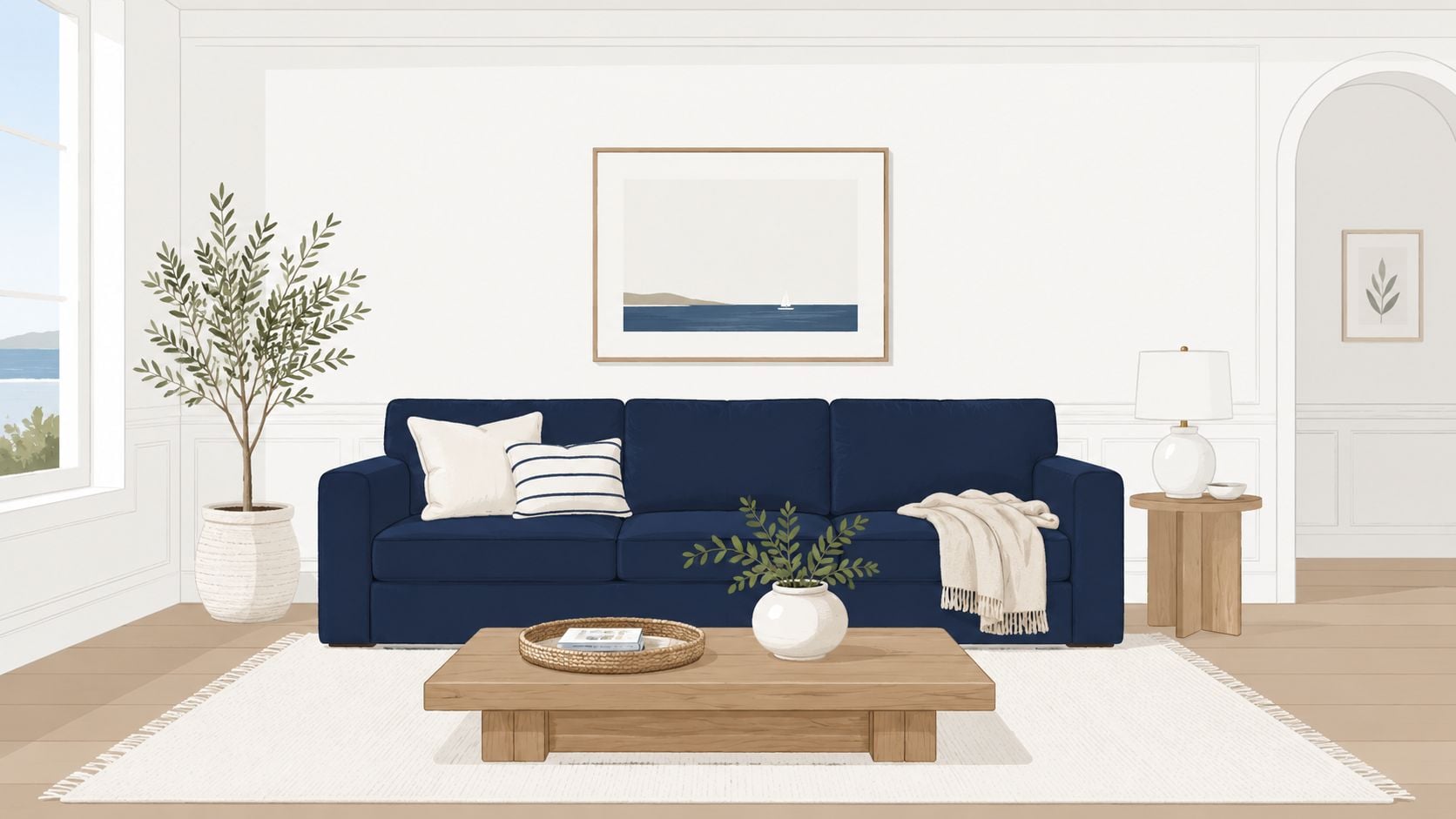
White is the cleanest partner navy has. The contrast is sharp, easy to read, and always looks intentional. In living rooms across Northwest Indiana, this pairing helps heavier furniture feel lighter and keeps dark upholstery from taking over the space.
A navy sofa with white pillows is an easy starting point. A Flexsteel or Bassett sofa in navy fabric can anchor the room, while white trim, white lampshades, and a light rug keep everything crisp. Bedrooms benefit too. Navy upholstery on the bed or bench looks fresh against white bedding and painted nightstands.
Why it works in real homes
This is one of the safest colors that go with navy because the balance is simple. White reflects light. Navy adds structure. Together they work in coastal, transitional, traditional, and even more refined home office spaces.
For families who want the room to feel polished but still livable, texture matters.
- Add warmth with wood: Oak, walnut, and medium wood finishes stop navy and white from feeling cold.
- Use linen and cotton: White throws, slipcovered accents, and woven pillows soften the contrast.
- Choose one hero piece: A navy sectional or accent chair gives the room focus without making every piece dark.
Practical rule: If the room gets limited natural light, keep the walls and largest case pieces white, then let navy show up in upholstery and art.
Homeowners looking for more guidance on whole-room balance can find useful direction in Groen's article on the perfect color palette for furniture and décor.
2. Navy + Warm Gold Brass The Luxe Statement
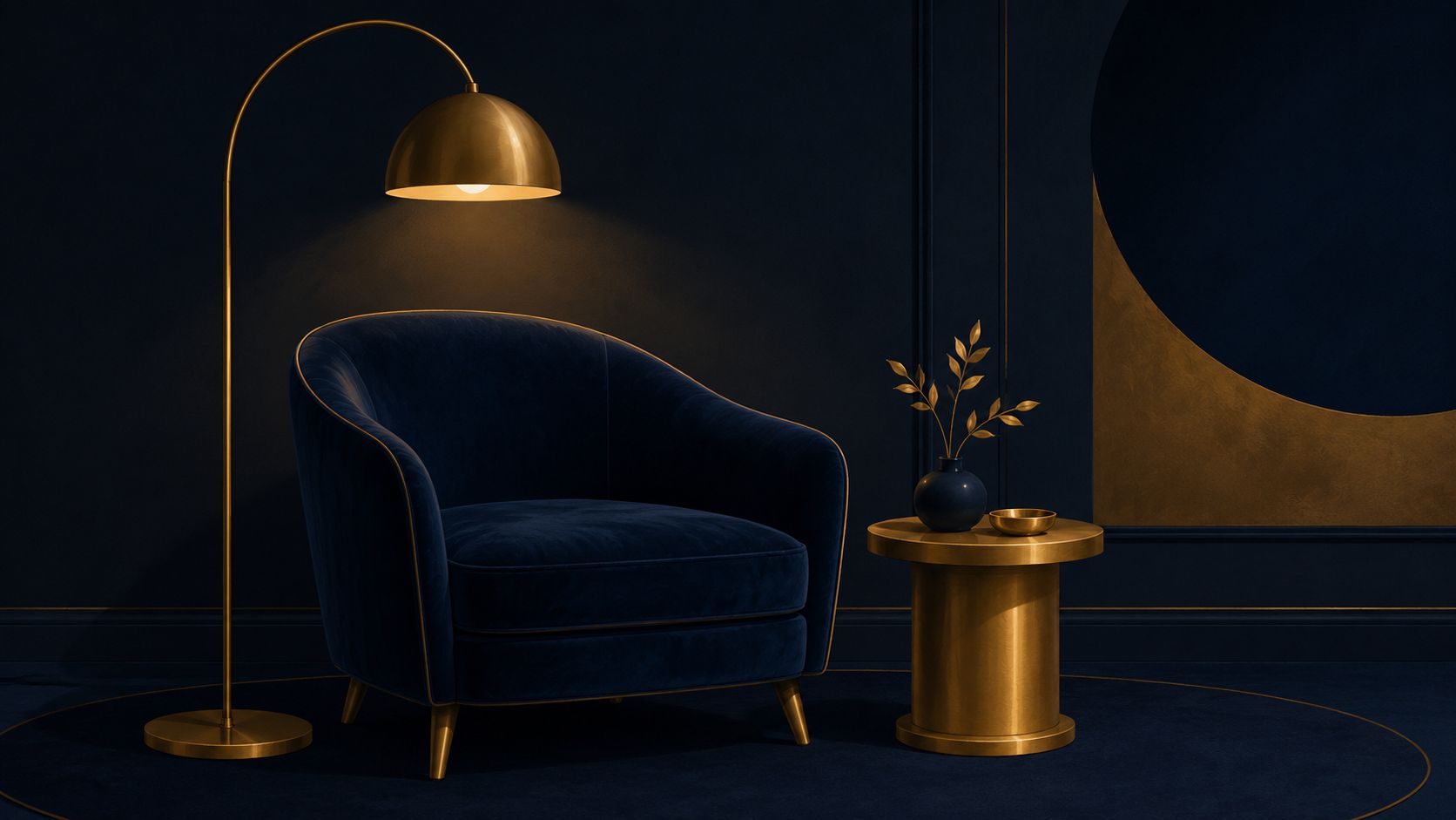
You walk into a dining room on a gray January afternoon in Northwest Indiana, and the space still feels warm. That is what navy and warm gold brass do well. Navy gives the room depth. Brass adds glow, detail, and a finished look that feels collected instead of cold.
This pairing works best in rooms that need a little polish without turning stiff. Dining rooms are a natural fit. Primary bedrooms are close behind. If you already have darker wood, structured upholstery, or traditional millwork, warm brass keeps navy from feeling too heavy and gives the whole room a richer point of view.
A Canadel dining set in a deep stain looks especially strong with brass pendant lighting or warm metal hardware on a nearby buffet. In a bedroom, a navy upholstered bed looks more custom with brass reading lamps, a warm ivory coverlet, and one or two muted gold pillows. For homeowners who want a more personal, long-lasting look, this is a smart way to bring in color and shine without committing to bright trends.
Use restraint here. A little brass goes a long way.
How to make it feel rich, not flashy
The best version of this palette uses texture more than sparkle. Choose brushed brass, antique brass, or satin finishes. Skip anything mirror-bright unless the room is already very formal.
A few guidelines help:
- Start with one navy anchor piece: A sofa, bed, or dining chair set should carry most of the color.
- Repeat brass in small doses: Lamp bases, drawer pulls, curtain rods, and picture frames should relate to each other.
- Soften the contrast with touchable materials: Velvet-look upholstery, woven fabrics, linen shades, and wood surfaces keep the room comfortable.
- Add one lighter note: Cream bedding, oat-toned drapery, or a soft area rug prevents the palette from feeling closed in.
This is also a strong choice for homeowners who want more color but do not want to repaint every wall. Groen's article on adding color to your home without painting gives practical ways to bring navy and gold into the room through upholstery, lighting, and accents.
Fabric matters more than people expect. A warm metallic accent works well on dining seats, benches, and throw pillows, and The Fabric Company's Supreme Solids shows the kind of old gold tone that pairs nicely with navy without looking brassy or harsh.
If you want this combination to feel at home in Northwest Indiana, keep the finish level relaxed. Matte metals, solid wood, and well-made upholstery from Groen's showroom give navy and brass the right kind of luxury. Comfortable, lasting, and never overdone.
3. Navy + Soft Gray The Modern Neutral Foundation
Gray makes navy feel calmer. The contrast is gentler than navy and white, which gives the room a smoother, more relaxed transition from dark to light. This is one of the best colors that go with navy for homeowners who want a modern space that still feels warm enough for everyday use.
A navy sofa paired with a gray rug and gray accent chair is a dependable living room formula. In bedrooms, a navy bed with a gray upholstered bench and charcoal lamp shades feels clean and current. This pairing also works well in home offices, where navy can add focus and gray keeps the mood steady.
How to keep it from feeling flat
The risk with navy and gray isn't clashing. It's monotony. The fix is simple. Add depth through texture and tonal variety instead of introducing too many extra colors.
A room works better when the gray family includes light and medium shades rather than one flat note. Think pale gray walls, a deeper gray rug, and a navy chair with mixed-texture pillows.
Navy should carry the visual weight. Gray should support it, not compete with it.
Useful combinations include:
- Warm gray upholstery: Better for family rooms and primary bedrooms.
- Cool gray accessories: Better for sleek offices and contemporary spaces.
- Natural finishes: Wood coffee tables, woven baskets, and matte ceramics break up the cool palette.
This pairing is also easy to personalize through custom furniture. A sectional with a navy body and gray toss pillows, or a bedroom with mixed upholstery tones, gives the room dimension without making it busy.
4. Navy + Cream Ivory The Soft Elegance
Cream and ivory soften navy immediately. Where white feels crisp, cream feels welcoming. That makes this pairing a strong fit for bedrooms, sitting rooms, and any living area where comfort matters more than contrast.
A navy upholstered bed against creamy bedding is one of the easiest ways to get a high-end look that still feels restful. In living rooms, cream drapery, off-white lamps, and an ivory performance rug can lighten navy seating without making the room feel stark.
Where this palette shines
This is a favorite for homeowners who want a space to feel established rather than trendy. Cream works beautifully with solid wood furniture, especially pieces with visible grain and warm stain. That makes it a natural partner for Amish bedroom sets, dining storage, and occasional tables.
This palette also layers well:
- Use cream on larger surfaces: Walls, rugs, and bedding create the soft foundation.
- Bring in navy through anchors: Sofas, headboards, dining chairs, or accent walls do the heavy lifting.
- Choose touchable fabrics: Chenille, linen, cotton, and soft woven throws keep the room inviting.
This combination suits Northwest Indiana homes where seasons shift the light dramatically. Cream helps rooms feel warmer in winter, while navy keeps them grounded year-round.
5. Navy + Coral Terracotta The Warm Accent Pairing
Navy needs warmth when a room starts feeling too serious. Coral and terracotta handle that job well. They energize navy without fighting it, and they add personality fast through small pieces.
A navy sectional with coral pillows changes the mood of a room in minutes. Terracotta pottery, rust-toned artwork, or a burnt clay throw on a navy chair can do the same job with a slightly earthier feel. This works especially well in family rooms, casual dining spaces, and multipurpose living areas where a little color keeps things lively.
How to use the accent without overdoing it
Navy should stay in charge. Coral and terracotta work best when they appear in doses, not in every corner.
A smart layout often looks like this:
- Start with one navy anchor: A sofa, wall, headboard, or area rug.
- Repeat the warm accent three ways: Pillows, art, and one decorative object usually does it.
- Use cream or beige around them: Neutral support keeps the palette grounded.
For homeowners drawn to richer orange-based accents, Groen's article on burnt orange curtains and room styling offers ideas that translate well to navy interiors. A custom chair with contrast piping, or a Canadel dining seat upholstered in a clay tone, can bring the accent in with more permanence.
6. Navy + Blush Pink The Romantic Contemporary
Blush pink gives navy a softer edge. This pairing feels current, but it doesn't need to look sweet or overly delicate. When navy leads and blush supports, the room feels calm, polished, and a little more personal.
Bedrooms are the easiest place to use it. A navy bed, blush pillows, and cream bedding create a layered look that feels settled. In a nursery or guest room, blush artwork, a pale pink throw, or a soft upholstered bench can warm the room without taking over.
The easiest way to style it
The best version of this palette keeps the pink dusty and muted. Bright pink fights navy. Soft blush complements it.
Contemporary color guidance regularly places navy alongside warm accents like blush pink and gold, while also identifying neutral companions such as cream and gray that help the palette stay balanced, as outlined in this navy pairing guide. That's a useful reminder for styling. Blush is strongest as an accent, not as the whole story.
A navy room with blush accents looks more grown-up when cream, ivory, or soft gray is present somewhere in the mix.
Homeowners who want to shape the emotional feel of a space can get more inspiration from Groen's piece on color coordinated rooms and setting the mood. This pairing also works well with warm metallics, especially rose gold or soft brass, on lamps, frames, and drawer hardware.
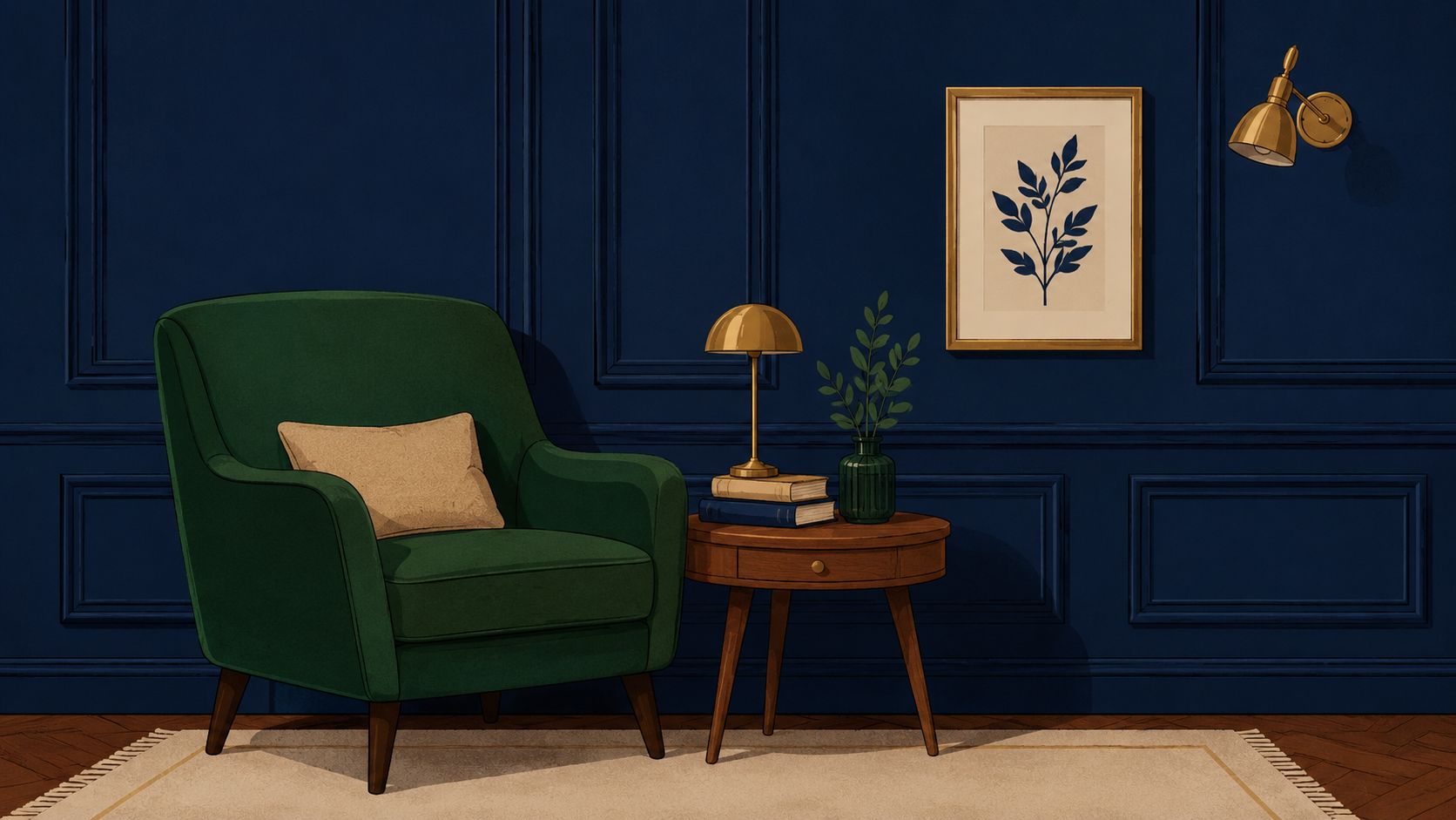
7. Navy + Hunter Green The Jewel Tone Richness
Some color pairings whisper. Navy and hunter green don't. They create depth, richness, and a formal mood that works beautifully in dining rooms, libraries, and primary bedrooms.
This combination feels best when the furniture has substance. Think an Amish solid wood dining table, a bookcase with visible grain, or a tall chest in a medium-to-dark stain. The wood keeps these two deep shades from collapsing into one dark mass.
Best furniture matches
One color should lead on the biggest surface. The second should support it through upholstery, drapery, or painted case goods. A navy wall with hunter green dining chairs works. So does a hunter green accent wall behind a navy upholstered bed.
Good pairings include:
- Amish solid wood furniture: Natural grain adds relief between two saturated colors.
- Canadel dining pieces: Custom finishes and chair fabrics help control the balance.
- Brass lighting: Warm metal keeps jewel tones feeling elegant rather than heavy.
Groen's article on green accent chairs for the living room can help homeowners picture how green seating fits into a navy-based room. This palette is especially strong in homes with formal dining areas or studies where a little mood is welcome.
8. Navy + Soft Sage Green The Calming Natural Palette
Sage green takes navy in a quieter direction. Instead of high contrast or formality, this palette creates a room that feels grounded and easy to live in. It suits bedrooms, reading corners, and family rooms where people want calm more than drama.
Sage walls with navy bedding make a bedroom feel settled. In a living room, a navy sofa and sage accent chair create enough contrast to stay interesting while still feeling soft. This is one of the most comfortable colors that go with navy for households that prefer a natural, understated style.
Texture matters here
The success of this palette depends less on color intensity and more on materials. Linen, brushed cotton, wool, matte ceramics, and natural wood all support the quiet mood.
A few reliable moves help:
- Use muted versions of both colors: Dusty sage and deep navy are easier on the eye than brighter versions.
- Layer in cream: Lampshades, throws, and rugs keep the room from reading too cool.
- Add plant life carefully: One or two leafy plants fit the palette well without cluttering it.
This is also an excellent palette for custom upholstery and solid wood bedroom furniture. Sage and navy can split the room evenly, or one can lead while the other shows up in textiles and art.
9. Navy + Deep Burgundy The Traditional Richness
Burgundy and navy create a classic, heritage-minded look. It's formal, layered, and strong. Used well, it feels timeless. Used carelessly, it can feel too dark. The answer is contrast, lighting, and restraint.
This pairing belongs in spaces that can handle a little depth. Formal dining rooms, libraries, and primary bedrooms are the most natural fit. A navy wall behind burgundy dining chairs, or burgundy bedding layered onto a navy bed, gives the room weight and character without making it gloomy.
How to keep it elegant, not heavy
Light trim helps immediately. So do warm wood finishes and reflective surfaces like lamps, mirrors, and framed art. Burgundy should usually arrive through fabric rather than through every major surface in the room.
A strong setup often includes:
- Navy on walls or the largest upholstered piece
- Burgundy in chairs, pillows, drapery, or bedding
- Wood and brass to connect everything
Deep color pairings need breathing room. White trim, light ceilings, and open floor space keep them refined.
Traditional furniture shapes work especially well here. Tufted headboards, wood dining tables, and framed accent chairs all support the mood. For homeowners who want classic style with long-term staying power, this combination has real presence.
10. Navy + Warm Tan Beige The Refined Neutral Balance
A lot of Northwest Indiana homes need a palette that feels grounded year-round. Navy with warm tan and beige does that job well. It softens navy without draining its character, and it gives you a look that feels settled, comfortable, and easy to live with for years.
This pairing works especially well in open layouts, where one color needs to carry from the kitchen to the dining area to the family room without looking forced. Use beige on the walls or area rug, then bring in navy through the larger pieces that anchor the room. A navy Flexsteel sectional, tan pillows, and a Canadel dining set in a warm wood finish create a connected look that still feels relaxed.
Bedrooms benefit from this combination too. Navy bedding on an Amish bed frame, paired with beige drapery or a camel bench, feels warm and pulled together without getting dark.
Best ways to use it at home
Keep the beige side warm. Skip cool greige here. Navy looks better with sand, camel, oatmeal, and tan because those shades take the edge off the blue and make the room feel more welcoming.
A strong setup usually includes:
- Beige or tan on the largest background surface, such as walls, rugs, or drapery
- Navy on the main anchor piece, such as a sofa, bed, or dining chairs
- Natural texture throughout, like wood, linen, woven rugs, and leather accents
Texture matters more than pattern in this palette. If the room feels flat, add slub linen pillows, a wool rug, cane details, or a lightly textured beige chair. Medium wood tones tie everything together and keep the space from feeling too crisp or too formal.
For NWI families who want one palette that can move through the whole house, this is one of the smartest choices in the bunch. It gives you warmth, flexibility, and enough depth to feel finished without constant redecorating.
Top 10 Navy Color Pairings Comparison
Choosing a navy palette gets easier once you compare how each option lives in a home. Some pairings keep a room bright and easy to furnish. Others ask for better lighting, stronger texture, or more deliberate furniture choices. For Northwest Indiana homeowners, that matters. You want a color plan that looks good in January, still feels right in July, and works with pieces you plan to keep.
This quick comparison helps you match the right navy pairing to the room, the mood, and the level of effort. It also gives you a practical way to narrow down what to test first in Groen's showroom, whether you are looking at a Flexsteel sofa, a Canadel dining set, or solid wood Amish bedroom furniture.
| Combination | Implementation Complexity | Resource Requirements | Expected Outcomes | Ideal Use Cases | Key Advantages |
|---|---|---|---|---|---|
| Navy + Crisp White: The Timeless Classic | Low. Straightforward palette. Watch undertones. | Basic paints and fabrics, layered texture, optional warm metal accents | Clean, high-contrast, open, timeless | Living rooms, bedrooms, home offices, dining rooms | Easy to use, widely appealing, helps rooms feel larger |
| Navy + Warm Gold/Brass: The Luxe Statement | Medium. Needs quality metal finishes and good lighting. | Brass or gold hardware, rich fabrics, controlled lighting | Warm, polished, eye-catching | Dining rooms, primary suites, home bars, executive offices | Adds glow, creates a strong focal point, works well with tailored furniture |
| Navy + Soft Gray: The Modern Neutral Foundation | Low to medium. Tone matching matters. | Multiple gray tones, textured fabrics, good lighting | Calm, current, understated | Modern living rooms, bedrooms, open-concept areas, offices | Flexible neutral base, easy to build on with other accents |
| Navy + Cream/Ivory: The Soft Elegance | Low. Simple to use if undertones stay warm. | Warm off-whites, natural wood, soft textiles | Soft, welcoming, refined | Primary bedrooms, coastal or farmhouse homes, family rooms | Gentler contrast than white, pairs nicely with wood and linen |
| Navy + Coral/Terracotta: The Warm Accent Pairing | Medium. Accent balance needs a careful hand. | Accent fabrics, throws, artwork, custom upholstery details | Warm, lively, full of personality | Living rooms, eclectic spaces, bedrooms, creative offices | Brings energy without overpowering the room |
| Navy + Blush Pink: The Romantic Contemporary | Medium. Balance keeps it current and grounded. | Quality blush fabrics, metallic accents, linen textures | Romantic but current, soft and polished | Primary bedrooms, nurseries, guest rooms, quiet retreat spaces | Adds warmth, feels approachable, improves bedrooms |
| Navy + Hunter Green: The Jewel Tone Richness | Medium to high. Deep tones need strong lighting. | Rich fabrics, natural wood furniture, brass or gold accents | Formal, layered, visually rich | Formal dining rooms, primary suites, libraries, studies | Strong color depth, beautiful with classic wood furniture |
| Navy + Soft Sage Green: The Calming Natural Palette | Low to medium. Muted tones need subtle coordination. | Sage paints or fabrics, natural textures, botanical accents | Calm, natural, restorative | Bedrooms, serene living rooms, wellness-focused spaces, offices | Relaxing feel, current look, ties warm and cool finishes together |
| Navy + Deep Burgundy: The Traditional Richness | Medium to high. Can feel heavy without enough light. | Burgundy upholstery, rich textiles, traditional wood, strong lighting | Deep, formal, heritage-driven | Formal dining rooms, libraries, traditional primary bedrooms, home bars | Rich character, timeless feel, strong fit for classic furniture |
| Navy + Warm Tan/Beige: The Versatile Neutral Balance | Low. Texture keeps it from feeling flat. | Tan or beige paints and textiles, layered texture, coordinating wood tones | Grounded, balanced, cohesive across rooms | Open-concept homes, multi-room schemes, transitional spaces | Inviting, flexible, easy to carry through the house |
Bring Your Navy Vision to Life at Groen's
Navy earns its reputation because it works in so many directions. It can feel classic with white, warm with cream, formal with brass, grounded with beige, or bold with burgundy and hunter green. That flexibility is exactly why it remains one of the smartest foundation colors for real homes. It holds up across changing trends, changing seasons, and changing family needs.
For homeowners in Dyer, Crown Point, St. John, Schererville, Munster, and across Northwest Indiana, the best navy palette usually starts with one practical question. How should the room feel when everyone is living in it? Comfortable and bright. Calm and quiet. Rich and formal. Relaxed and natural. The companion color should answer that question right away.
Furniture choices matter just as much as paint and accessories. A navy sofa in a durable fabric reads differently from a navy accent wall. A cream rug softens a room in a different way than cream bedding. Brass hardware adds a sharper note than natural wood. That's why room planning works better when homeowners can see fabrics, finishes, silhouettes, and wood tones together instead of trying to imagine them one at a time.
That's also where custom options become especially valuable. A Canadel dining set can help shape a navy-and-gold or navy-and-cream dining room with a more personal finish mix. Amish solid wood furniture gives deeper palettes like navy with hunter green or burgundy the natural texture they need. Upholstery choices from lines such as Flexsteel and Bassett can help homeowners land on the right navy, beige, gray, or blush combination for the scale and mood of the room.
Special financing, subject to credit approval, can also make it easier to build the room the right way instead of settling for pieces that don't quite fit the home. For many families, that flexibility means they can choose lasting materials, better comfort, and a more cohesive design plan without rushing the process. White-glove delivery adds another layer of ease when larger pieces are part of the plan.
Groen's Fine Furniture serves Northwest Indiana with showrooms in Dyer and Crown Point, along with custom furniture, solid wood options, and personalized guidance. Homeowners who want help narrowing down the best colors that go with navy can bring in inspiration photos, fabric ideas, or room measurements and work through the options in person.
Visit Groen's Fine Furniture in Dyer or Crown Point today to explore custom options, compare fabrics and finishes, and ask about special financing plans. Groen's family can help Northwest Indiana homeowners create a comfortable, lasting home with furniture that fits their style.