Blog
How to Choose Sofa Color That Fits Your Home


For homeowners in Dyer, Crown Point, and throughout Northwest Indiana, choosing a sofa color usually starts with a deceptively simple question: “Which shade looks best?” The better question is, “Which shade will still look right after years of children, pets, changing light, and everyday living?” A sofa is too large and too frequently used to choose by website photograph alone.
The right answer depends on room size, natural light, existing colors, upholstery performance, and the mood the household wants to create. A calm neutral may be the smart foundation, while an earthy green or deep navy may be exactly what a large, bright room needs. The decision becomes much easier when the color is tested in the actual home and ordered in a fabric suited to real life.
A Living Room Worth Coming Home To
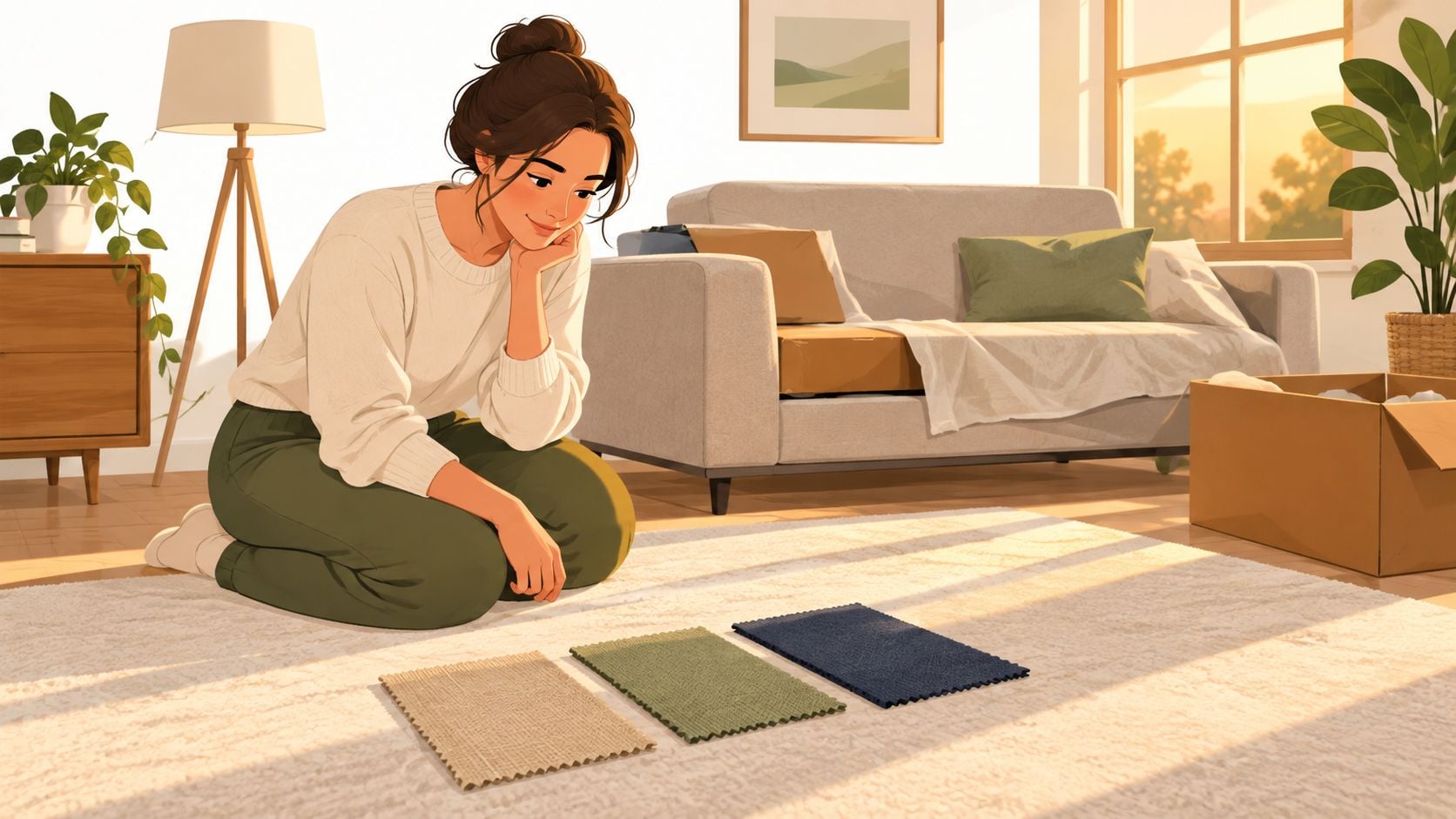
A homeowner in Dyer has three sofa swatches spread across the living-room rug. One is warm beige, one is sage green, and one is navy that looked perfect in a website photograph. The room has two young children, a golden retriever, south-facing windows that pour sunlight across the sofa every afternoon, and walls that looked greige on the paint card but turn faintly lavender after dark.
That choice isn't merely decorative. The wrong sofa color can fight the rug, reveal every smudge, fade unevenly near the windows, or make the room feel colder and smaller. A color that looks refined on a screen may become harsh under evening lamps, while a supposedly soft neutral may pull yellow against the wall.
Practical rule: The best sofa color is the one that works with the room's light and the household's habits, not the one that wins a showroom glance.
The process starts with the room itself. Its dimensions, ceiling height, window direction, flooring, and fixed finishes narrow the field before anyone compares dozens of fabric samples. Buyer preferences also offer useful context. A foundational study from Berkeley's color-preference research found that people tend to prefer lighter, calmer living-room hues, including light blue, because those colors support a relaxed emotional tone.
From there, the practical questions matter just as much. Neutrals remain flexible, but not every beige or gray behaves the same way. Fabric weave, pattern density, cleaning requirements, sunlight, children, pets, and daily wear all change how a color looks over time.
The most reliable path is straightforward:
- Read the room: Measure the space and study its natural and artificial light.
- Choose the role: Decide whether the sofa should blend into the background or anchor the room.
- Coordinate deliberately: Match the largest existing surfaces before chasing a favorite shade.
- Specify the upholstery: Pair color with a weave, pattern, and cleaning method that can handle real use.
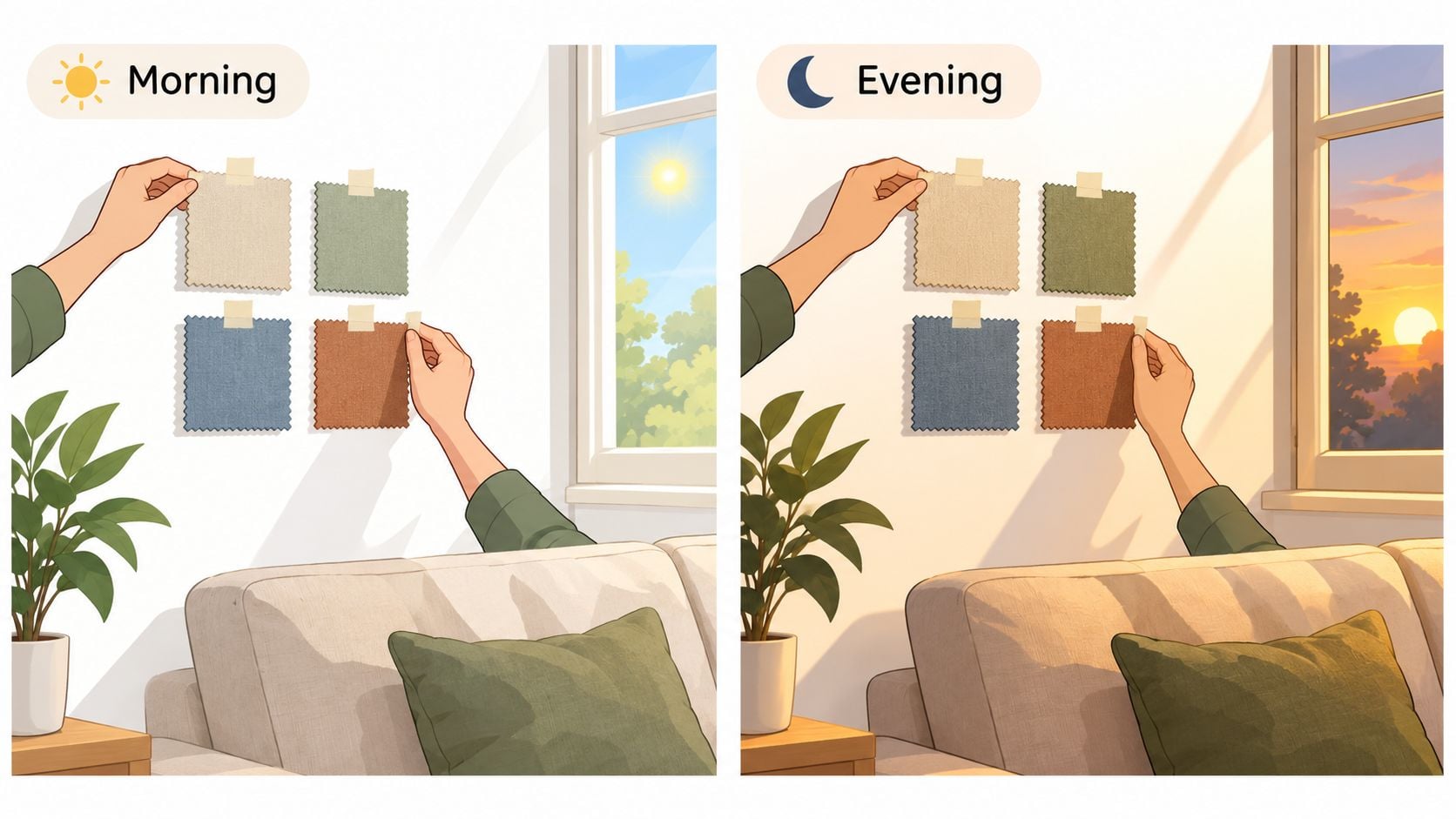
- Test before ordering: View swatches against the wall, rug, flooring, and art at different times of day.
- Use local guidance: A showroom consultation and custom order can turn a close guess into a confident decision.
Groen's Fine Furniture serves families across Dyer, Crown Point, St. John, Schererville, Munster, and the wider NWI area. With the right testing process, the family with the three swatches can choose a sofa that feels comfortable now and remains easy to live with years from now.
Read the Room Before You Pick the Color
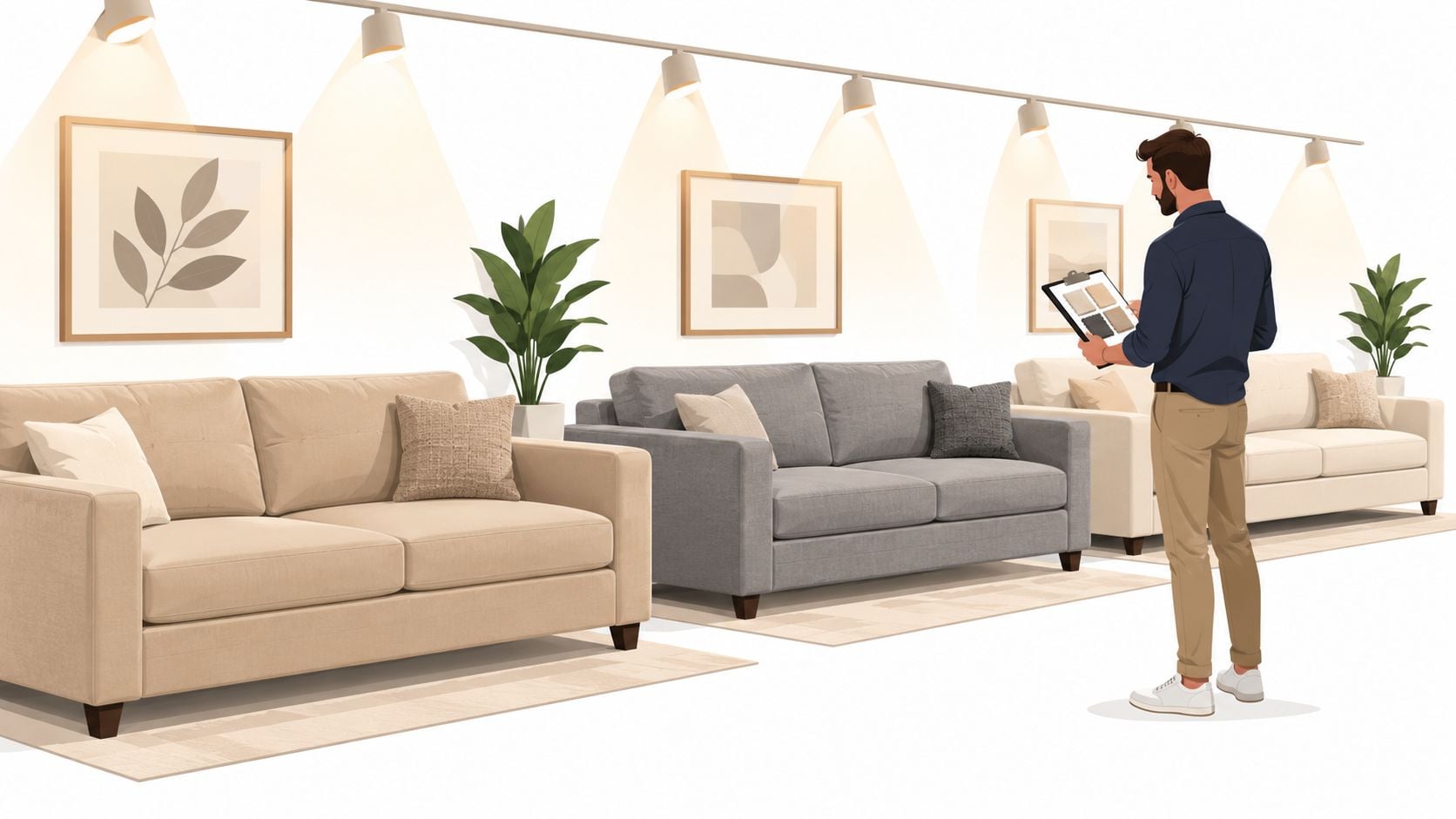
Room size and lighting should determine the first sofa-color shortlist. They shouldn't be treated as finishing details after a favorite shade has already been chosen.
A small or low-ceiling room generally benefits from light beige, soft dove gray, warm cream, or another pale neutral. Lighter upholstery keeps the visual field open and helps the sofa feel less imposing. In a large, bright room, richer colors such as navy, forest green, charcoal, or deep brown can add definition without making the space feel cramped.
Room proportions matter because a dark sofa carries more visual weight. As a practical rule of thumb, a dark sofa can make the perceived floor area feel roughly one to two feet smaller on each side, depending on the sofa's scale and the surrounding finishes. That doesn't make dark upholstery wrong. It means the room must have enough breathing space to support it.
Match the color family to the light
- North-facing rooms: These spaces often feel cooler and dimmer. Warm taupe, camel, oatmeal, and soft mushroom counter the blue cast better than icy gray or blue-white.
- South-facing rooms: Strong yellow-white daylight can support cooler gray-greens, slate, blue-gray, and softened navy without making the room feel cold.
- East-facing rooms: Morning brightness followed by flatter afternoon light favors adaptable mid-tones such as putty, mushroom, and balanced greige.
- West-facing rooms: Warm evening light can intensify yellow and orange undertones, so muted taupe, olive-gray, or neutral slate can provide needed restraint.
Light-colored upholstery can help a dim room feel more open. The same principle applies to a small space with limited windows, where white, cream, and pale gray can visually brighten the setting, as explained in this expert guide to choosing a color palette.
Before browsing a palette, record the window count, ceiling height, floor tone, wall undertone, and sofa footprint. A room with warm oak flooring needs a different neutral strategy from a room with cool gray tile.
| Room Condition | Best Sofa Color Family | Avoid |
|---|---|---|
| Small, dim, or low-ceiling room | Warm cream, light beige, pale greige | Heavy charcoal, very dark brown, saturated navy |
| Large room with strong daylight | Forest green, navy, charcoal, rich taupe | Washed-out pale shades that leave the room visually empty |
| North-facing room | Camel, warm taupe, mushroom | Icy gray and blue-white |
| South-facing room | Gray-green, slate, softened navy | Strong yellow beige that becomes more intense in sunlight |
| East- or west-facing room | Putty, balanced greige, mid-tone stone | Highly yellow or highly blue shades |
Why Neutrals Still Lead the Conversation
Neutral sofas remain the safest long-term choice because they adapt to real households. Beige, gray, cream, greige, and taupe work with changing rugs, artwork, seasonal pillows, and wall colors. They also hide the visual disruption caused by everyday life, from muddy shoes in winter to pet hair and children's spills. At Groen's, that flexibility matters when you are choosing a custom sofa expected to look right for years, not just on delivery day.
A 2024 survey summarized by Living Spaces found that 68% of respondents preferred a neutral living-room color scheme, with gray the favorite sofa color at 49% (Living Spaces, 2024). Neutrals give buyers room to picture their own belongings, create a calm setting, and let a household update accent chairs, throws, or artwork without replacing the main seating.
Not every neutral is interchangeable
A warm neutral carries yellow, red, or brown undertones. It feels welcoming beside natural wood, woven textures, and warm flooring. A cool neutral carries blue, green, or violet, creating a cleaner, more contemporary effect.
Greige sits between gray and beige, yet the undertone determines whether it works. Yellow-beige can fight gray or lavender walls. Purple-leaning greige may look dull under cool light. True gray can appear crisp in a bright room but chilly beside blue-gray flooring.
A neutral sofa should match the room's temperature, not merely its color name.
Choose warm neutrals for a family room meant to feel relaxed and comfortable. Choose cool neutrals for a more composed, modern room. Deeper taupe bridges both directions, adding warmth without the strong yellow cast found in some beiges.
Fabric performance should guide the color decision too. A pale, tightly woven performance fabric can stay practical in a busy home, while a deep neutral may better disguise marks on a looser texture. Ask to see the actual upholstery, not only a digital color image. Groen's showroom lets you compare custom-order fabrics under real indoor lighting and judge how the weave changes the color.
Use data as a starting point, not a substitute for judgment
Fixr's interior color trends report reports that 49% of experts identified warm neutrals as a top trend, while 60% said integrating nature into homes was the biggest design trend. The report also found that 48% expected dark, earthy greens to take center stage and 55% expected color drenching to be popular.
Use those trends selectively. Choose a neutral when the sofa must handle changing décor and demanding routines. If the room needs more character, olive, moss, or deep green can add depth while remaining grounded. Review the swatch beside your flooring and wall color, then consider how Northwest Indiana daylight, winter clothing, kids, and pets will affect the fabric's appearance.
Coordinating With the Room You Already Have
The sofa shouldn't be matched to an empty idea of the room. It needs to work with the wall color, flooring, area rug, curtains, fireplace, built-ins, and artwork already in place.
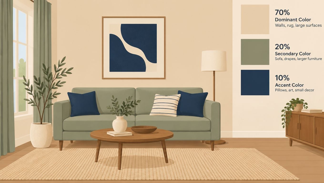
The 70-20-10 rule offers a useful framework. Roughly 70 percent of the room comes from the dominant wall and rug colors, 20 percent from secondary elements such as the sofa and drapery, and 10 percent from accents including pillows, art, and decorative objects. It isn't a rigid formula. It simply prevents every large item from competing for attention.
Start with the largest fixed surface
Look at the wall or area rug first, whichever occupies more visual space. If the rug is patterned, identify its quietest neutral rather than copying its most vivid color. If the walls are warm greige, the sofa can repeat that temperature in a deeper taupe or create controlled contrast with a muted olive.
Next, identify a secondary tone in a fireplace surround, built-in shelving, flooring, or large piece of art. That tone can guide the sofa's undertone. A room with warm wood and cream walls usually welcomes camel, mushroom, olive, or warm gray. A room with blue-gray walls and pale flooring can take slate, cool gray, softened navy, or a restrained gray-green.
The sofa becomes the bridge between those elements. It doesn't need to match every item. It needs to make the major surfaces look intentional together.
- For a patterned rug: Choose a sofa in one of the rug's quieter colors, preferably with a solid or subtly heathered texture.
- For bold artwork: Let the art keep the spotlight and use a grounded neutral, unless the sofa is deliberately intended as the room's anchor.
- For gray or greige walls: Compare undertones in daylight. A warm stone can soften gray walls, while a cool gray-green can sharpen a warmer greige.
- For mismatched existing pieces: Match the largest neutral surface first. The sofa should calm the room rather than amplify every conflict.
Contrast works best when it has a purpose. A darker sofa can anchor pale walls, while a lighter sofa can keep a deep wall color from closing in the room.
Accent color can then be added in smaller pieces. For a soft blue layer that doesn't overpower a neutral sofa, homeowners can explore this guide to styling baby blue cushions in your home. More guidance on using color to shape the atmosphere is available in Groen's color-coordinated setting guide.
Fabric, Pattern, and How Color Holds Up
Sofa color can't be separated from upholstery performance. The same shade can look completely different in a flat solid, a heathered weave, a patterned fabric, or velvet with a directional nap.
Natural fibers such as cotton and linen often take dye with appealing depth, but they can show spills and soil more readily. Performance fabrics, including Crypton, Sunbrella, and polyester blends, are designed for households that need easier maintenance and stronger resistance to everyday wear and fading. The correct color still matters, but the fabric determines how reliably that color survives use.
Tight weaves generally read slightly darker because they absorb and reflect light differently from looser textures. Velvet changes tone as its nap shifts, so one side of the cushion may appear lighter in morning light while the same surface looks deeper in the evening. Pattern density also affects perception. A small-scale pattern breaks up the visual field and hides marks more effectively than a flat, pale solid.
The practical choice for busy households
Families with children, pets, or frequent guests should usually consider a mid-tone patterned performance fabric. It disguises small amounts of particulate soil, pet hair, and everyday variation better than a solid white, pale cream, or very dark solid.
Very light upholstery reveals coffee, oils, food grease, and edge soil quickly. Very dark upholstery can hide some stains but often makes dust, lint, and fading more visible. A mid-value color with visual texture is the most forgiving balance.
- Kids and food: Choose a serviceable weave with a cleaning method suited to water-based and oily marks.
- Pets: Favor heathered or patterned upholstery that breaks up hair and minor abrasion.
- Sunny windows: Ask about colorfastness and consider a shade that won't make gradual fading obvious.
- Frequent entertaining: Select a pattern or textured solid that looks composed between cleanings.
Pilling is another concern. Fiber blend, friction, and weave affect whether small surface pills develop on high-contact areas. Cleaning codes also matter because a color that looks excellent on day one may appear uneven after an unsafe cleaning method.
| Fabric Type | Color Appearance | Stain Resistance | Best For |
|---|---|---|---|
| Cotton or linen | Rich, natural, and tactile | More vulnerable to visible staining | Lower-traffic rooms and households prepared for careful maintenance |
| Polyester blend | Consistent, adaptable, and available in many tones | Often easier to maintain than delicate natural fibers | Family living rooms and everyday seating |
| Performance fabric | Stable, practical, and available in solids or patterns | Designed to resist common household wear and staining | Children, pets, and frequent entertaining |
| Velvet | Deep, dimensional, and light-sensitive because of nap direction | Requires attentive care | Formal rooms or households comfortable with texture maintenance |
| Patterned woven fabric | Layered color that disguises minor marks | Visual camouflage varies with pattern density | High-use rooms where appearance between cleanings matters |
Groen's upholstery fabric guide helps shoppers evaluate fabric as part of the full sofa decision rather than treating color as an isolated choice.
Testing Swatches the Right Way
A screen can't show how a sofa color behaves beside a particular wall, rug, floor, and window. Swatches turn a guess into a controlled comparison.
Start with the top two or three candidates. More choices usually create confusion rather than clarity. Each swatch should be large enough to reveal its undertone and texture, not a tiny clipped sample that hides how the weave catches light.
A reliable home test
- Place each swatch near the sofa's planned position. Tape it to the wall or set it against the intended upholstery area. Keep the rug and nearby furniture in view.
- Check it in midmorning natural light. Look for whether the color turns too blue, yellow, pink, or gray.
- Recheck it in late-afternoon sun. South-facing windows can brighten pale fabric and intensify warm undertones.
- View it in the evening with installed lamps on. A shade that works during the day may become lavender, muddy, or overly yellow under warm bulbs.
- Hold it against the rug, wall, and large artwork. Decide whether it bridges those elements or creates deliberate contrast.
- Rub a clean white cloth across the surface. Look for dye transfer, loose fibers, and early signs of pilling.
The testing process should include texture, not just hue. Tilt the swatch, turn it around, and view it from the angle where someone will normally sit. Velvet nap, woven slubs, and directional fibers can shift the apparent depth of the color.
A swatch that works only in one lighting condition isn't a successful swatch.
If every candidate fails, use a clear decision order. First prioritize the shade that flatters the wall. Then choose the option that sits comfortably with the rug. After that, use lighting as the final tie-breaker. A favorite hue that fights the wall will remain difficult no matter how attractive it looked in the original photograph.
Care instructions should be checked during this stage. Immediate blotting, lifting excess material before cleaning, testing products in an inconspicuous place, and matching the method to the stain chemistry protect both the fabric and its color. Groen's guide on avoiding color mismatch when ordering online reinforces why home testing belongs before commitment, not after delivery.
Bringing It All Together With Groen's
Buying a sofa color online asks a homeowner to trust a screen, unknown lighting, and a fabric description. A local custom-order process removes much of that uncertainty by letting the household compare actual upholstery samples, test comfort, and coordinate the sofa with the room before the order is finalized.
Groen's Fine Furniture offers custom sofa options in which shoppers can evaluate the fabric, finish, and leg style together. The design-your-own-sofa process gives the color decision a broader context. The sofa isn't selected as a disconnected product. It is specified as part of the room.
A more useful showroom appointment
A productive consultation should bring the room into the conversation. Homeowners can bring photographs of the rug, wall color, flooring, and nearby artwork, along with measurements and notes about window direction. The showroom team can then compare fabric grades, textures, and tones side by side rather than relying on memory.
Comfort testing matters just as much as color. Cushion density, seat depth, back support, and frame construction determine whether the sofa feels right during a quick visit and after a long evening. Flexsteel can be considered when durability is a priority, while Bassett offers a range of style directions. Performance upholstery helps connect the chosen color to the everyday realities of children, pets, and regular guests.
The same approach applies throughout the home. Canadel supports made-to-order dining choices, and Amish Furniture brings solid wood craftsmanship to pieces intended to last across generations. For sleep products, Serta and Beautyrest can be evaluated with health, rest, and guidance from a helpful mattress guide in mind, rather than selected from specifications alone.
Local service closes the gap
A locally owned retailer can also address delivery details that a national carrier may overlook. Northwest Indiana homes may involve tight staircases, narrow entrances, or HOA entry requirements. White-Glove Delivery helps carry the process from the showroom to the room where the sofa will live.
Groen's multigenerational ownership and history serving NWI since 1983 support a personal buying process for households in Dyer, Crown Point, St. John, Schererville, and Munster. Special Financing is available, subject to credit approval, which can provide additional buying power while keeping the purchase aligned with the household budget. The team can also remain a contact for fabric-care questions and warranty service after delivery.
A confident sofa-color decision comes from combining real-light testing, suitable upholstery, honest room coordination, comfort testing, and made-to-order flexibility. That approach protects the room from a color mistake and gives the sofa a better chance of looking right through changing seasons and daily life.
Visit Groen's Fine Furniture in Dyer or Crown Point to compare sofa colors, performance fabrics, and custom-order options in person. The family-owned team offers five-star service, White-Glove Delivery, and Special Financing subject to credit approval, so Northwest Indiana homeowners can test drive the comfort and create a room they'll enjoy coming home to.