Elevate Your Home: Earth Tone Color Schemes 2026

A lot of homeowners around Northwest Indiana are standing in the same spot right now. The walls feel plain, the furniture doesn't quite connect, and the room still isn't giving that settled, comfortable feeling everyone wants at the end of a long day.
That's where earth tone color schemes can help. They're not flashy, and that's exactly their strength. They pull a room toward warmth, calm, and permanence, which tends to matter even more in Dyer, Crown Point, St. John, Schererville, Munster, and other NWI homes where families want spaces that feel lived in, welcoming, and lasting.
Creating a Grounded Home in Northwest Indiana
In Northwest Indiana, home often needs to do a lot. It has to feel restful after a long commute, durable enough for everyday family life, and polished enough for guests without seeming stiff or overdone. Earth tone color schemes work well because they answer all three needs at once.
An earth tone is a color tied to natural materials like soil, sand, stone, bark, and foliage, including hues such as terracotta, ochre, moss green, and slate gray, as described in this overview of natural earth-inspired colors. In simple terms, these are colors that feel grounded instead of loud. They tend to sit comfortably in a room rather than demanding attention every second.
Readers often get stuck on one point right away. They assume earth tones mean “all brown” or “everything dark.” That's not the case. A good earth tone palette can include light neutrals, muted greens, clay reds, soft grays, and warm wood shades that make a room feel open and easy to live in.
What grounded actually looks like
A grounded room usually has a few things in common:
- Soft visual weight that helps the room feel calm rather than busy
- Natural-looking color relationships so nothing feels random
- Materials with character such as wood, linen, leather, or woven textures
- A sense of permanence that doesn't feel tied to a passing fad
A comfortable room rarely comes from one perfect paint chip. It comes from several quiet choices working together.
That's why earth tone color schemes hold up so well over time. They support daily life. They make a living room feel easier to sink into, a dining room feel more welcoming, and a bedroom feel more restful without trying too hard.
The Enduring Appeal of Earth Tone Colors
Earth tones have staying power because they connect directly to the natural world. According to this guide on earth tone palettes and biophilic interiors, earth-tone palettes are proven to induce biophilic psychological responses, specifically reducing anxiety and promoting feelings of stability and safety by mimicking soil, stone, and foliage.
That sounds technical, but the effect is easy to understand. People usually feel better in rooms that remind them of the outdoors. A room with clay, moss, bark, sand, and stone-inspired colors tends to feel easier on the eyes and easier on the nervous system.
For homeowners who like organic, relaxed spaces, styles with a rustic edge often show this beautifully, especially in inspiration rooted in mindfully rustic interiors.
Warm earth tones and cool earth tones
Confusion often arises. Many people know they like earth tones, but they don't know whether they prefer a warm palette or a cool one.
Here's the simplest way to separate them:
| Family | Examples | Typical feeling |
|---|---|---|
| Warm earth tones | terracotta, rust, ochre, camel | cozy, inviting, sun-baked |
| Cool earth tones | sage, olive, charcoal, dusty blue | calm, quiet, shaded, tailored |
A warm palette usually works well in spaces where a household wants comfort and softness. Think family rooms, dining rooms, or bedrooms that should feel cocooning. Cool earth tones often fit homes that lean cleaner or more understated, especially when a room already gets strong daylight.
Why the 1970s still matters
The most iconic historical milestone for earth tones came in the 1970s, when avocado green (#568203), harvest gold (#D4A017), burnt sienna (#E97451), and burnt orange/rust (#B7410E) became defining colors across design, fashion, and interiors, as outlined in this history of the 1970s earth tone palette.
Those shades mattered because they moved earth tones from traditional clay-based pigments such as umber, ochre, and sienna into everyday home design. That decade also helped divide the broad family into what many people still think of now as warmer and cooler earth-inspired groups.
Practical rule: If a room should feel snug and welcoming, start with the warm side. If it should feel quiet and airy, start with the cool side.
Building Your Foundation with Ready-to-Use Palettes
A palette gets easier when it stops feeling abstract. Instead of thinking about dozens of paint chips at once, it helps to start with a simple formula. Designers recommend a 60-30-10 rule for earth tone palettes, with 60% dominant neutral, 30% secondary earth tone, and 10% accent color, as explained in this breakdown of the 60-30-10 earth tone approach.
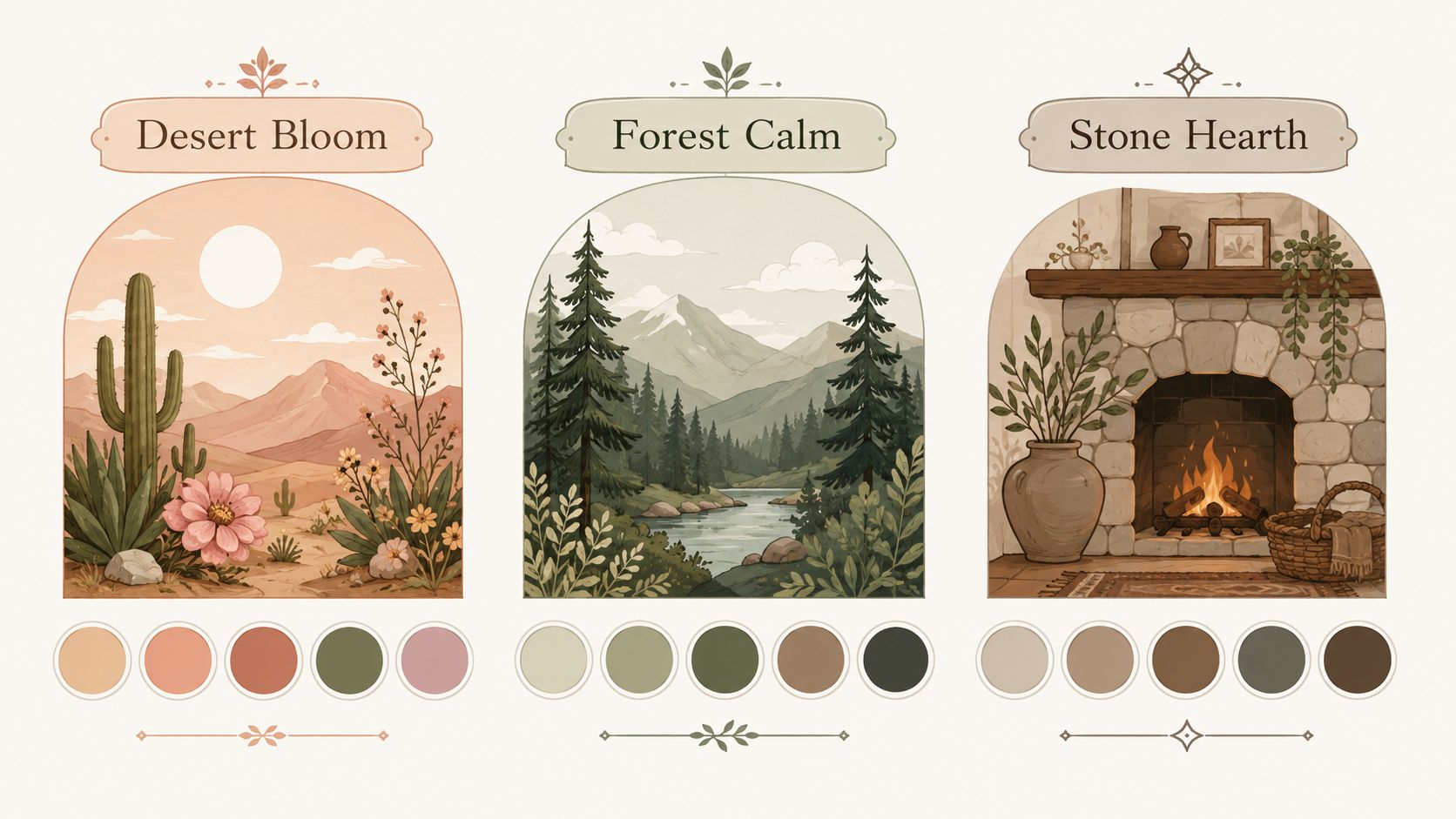
That formula doesn't make a room rigid. It gives the eye a clear place to rest. The dominant neutral carries the room, the secondary color adds identity, and the accent keeps things from feeling sleepy.
For readers also thinking about how stain color affects the floor beneath the palette, this expert guide for Long Island homeowners gives helpful visual context on coordinating undertones.
Lake Michigan Dune
This palette feels light, sandy, and relaxed. It works well in living rooms, open dining spaces, and smaller homes that need warmth without heaviness.
- 60 percent dominant neutral: warm beige or sandy taupe on walls and large upholstery
- 30 percent secondary tone: soft camel or muted ochre through area rugs, accent chairs, or drapery
- 10 percent accent: charcoal or weathered black in lamps, frames, or small decor
This palette is good for readers who say, “Earth tones sound nice, but I still want the room to feel bright.”
Schererville Sunset
This one leans warmer and fuller. It suits dining rooms, family spaces, and any room where the goal is conversation and comfort.
- Main layer uses creamy taupe or warm greige
- Supporting color comes from rust, terracotta, or clay
- Accent lands in burnt orange or deep brown
The mood is easy to read. It feels gathered, familiar, and welcoming, especially with wood furniture and soft lamp light in the evening.
The accent color shouldn't take over. It should act like a final seasoning that wakes up the rest of the room.
Indiana Woodland
This palette sits on the cooler side of earth tones. It still feels natural, but it reads more refined and calm than sun-baked and cozy.
| Part of palette | Suggested direction | Best use |
|---|---|---|
| 60 percent | warm gray or light mushroom | walls, larger case goods, major seating |
| 30 percent | sage or olive | side chairs, bedding, patterned textiles |
| 10 percent | deep charcoal or dusty blue | pillows, artwork, small accents |
This option works especially well for bedrooms, reading rooms, and spaces where the household wants a little more quiet than drama.
Readers who want more help comparing undertones can also browse this in-house look at finding the perfect color palette.
Choosing between the three
A quick shortcut can help:
- Choose Lake Michigan Dune if the room needs softness and lightness.
- Choose Schererville Sunset if the room feels best with warmth and hospitality.
- Choose Indiana Woodland if the room should feel calm, cool, and settled.
The point isn't to copy a palette exactly. It's to start with a recipe that makes color decisions less stressful.
Pairing Palettes with Furniture Materials and Fabrics
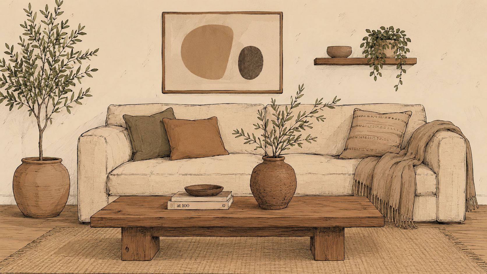
Color alone won't carry an earth tone room. According to this guide on balancing earth tones with texture, successful earth tone palettes typically follow a 70% to 30% temperature ratio, and the same source stresses that texture matters more than color variation in muted schemes. Mixing materials like leather with linen or rattan with wool keeps a room from looking flat.
That's a major point many homeowners miss. If every piece is matte, smooth, and close in tone, the room can feel dull even when the colors are technically right. Earth tone color schemes need contrast through touch as much as through hue.
Readers sorting through fabric choices can get more detail from this guide to understanding upholstery materials.
Woods and finishes
Wood sets the emotional temperature of the room faster than many people expect.
- For warm palettes: oak, medium brown finishes, and wood with honey or caramel character support terracotta, camel, rust, and ochre.
- For cool palettes: walnut, ash-toned finishes, and darker, quieter wood looks pair nicely with sage, olive, charcoal, and dusty blue.
- For mixed rooms: a neutral brown wood often bridges both sides without forcing the room too warm or too cool.
Solid wood matters here because it shows variation. Grain, stain depth, and natural tone shifts all add life to a muted room.
Metals and smaller surfaces
Metals should support the palette, not interrupt it.
A warm earth tone room often handles aged bronze, antique brass, or blackened metal well. A cooler palette tends to look cleaner with darker metal, soft black, or understated finishes that don't reflect too sharply.
Glossy chrome can work in some homes, but in many earth tone interiors it can feel detached from the softness of the rest of the room.
Fabrics that keep the room alive
Trusted upholstery lines truly excel. A well-designed frame in a durable fabric from Flexsteel can ground a family room, while a more fashion-forward silhouette from Bassett may help a living space feel layered instead of heavy.
The best pairings usually look something like this:
- Warm earth palettes pair well with leather, linen, woven performance fabrics, and nubby textiles in sand, clay, tobacco, or camel.
- Cool earth palettes work nicely with textured neutrals, soft woven fabrics, bouclé-like surfaces, and muted patterned textiles in sage, charcoal, or stone.
- Accent pieces should add texture first. A woven ottoman, a leather chair, or a chunky throw often does more than another color ever could.
A muted room gets its personality from surfaces. Smooth, rough, woven, soft, and weathered finishes are what make the palette feel finished.
A simple material check
Before finalizing a room, it helps to ask three questions:
- Is most of the room reading warm or cool?
- Is there a smaller amount of the opposite temperature for contrast?
- Are at least two or three textures working together instead of repeating the same surface everywhere?
If the answer to the last question is no, the room probably doesn't need another color. It needs another material.
Customizing Your Earth Tone Vision

The hardest part of earth tone decorating is often the last ten percent. A homeowner finds a paint color, chooses a sofa, then struggles to find the right dining finish, the right chair fabric, or the right wood tone to pull everything together. That's why custom work matters. “Close enough” is usually where a room loses its clarity.
Earth tones have a long design history. As noted earlier in this article, the style moved from traditional clay pigments into mainstream interiors through the 1970s, and that history connects naturally to solid wood furniture that carries visible grain, warmth, and depth. Those qualities are especially valuable when a room depends on natural, grounded color.
Why custom order makes sense
A made-to-order approach gives a homeowner control over the details that affect the whole room:
- Wood species changes the undertone of the space
- Stain choice determines whether the room reads warmer, cooler, lighter, or richer
- Fabric selection decides whether a piece blends or adds depth
- Scale and shape help the furniture fit the actual room instead of forcing compromises
That's especially useful for bespoke Amish furniture, where solid wood construction and finish choice can anchor an entire palette. The dining table, bedroom case piece, or occasional chair often becomes the visual center of the room, so the undertone needs to be right.
Where custom dining becomes the hero piece
Dining rooms respond especially well to custom planning. A family may want a lighter wood finish to keep the room open, a deeper stain to add weight, or upholstery that ties into nearby living spaces. That level of flexibility is the strength of a made-to-order line such as the paint color planning guide for custom spaces, especially when pairing finish and fabric.
A few natural accents can finish the look beautifully. Homeowners who want a sculptural, low-maintenance organic touch may enjoy these ideas to transform your space with cacti, which pair surprisingly well with warm and cool earth palettes alike.
The more subtle the palette, the more important exact material choices become.
That's the argument for customization. In an earth tone room, small differences matter. The right wood stain or textile doesn't just match the room. It makes the room feel intentional.
Making Your Dream Room a Reality
A lasting home usually comes from better decisions, not faster ones. Good furniture earns its place through comfort, durability, and the way it supports daily life year after year. That's why many families think of high-quality pieces as an investment rather than a temporary fix.
Still, even when the long-term value is clear, timing matters. A homeowner may be ready for a better sofa, a more durable dining set, or a bedroom refresh that finally feels restful, but they still want the purchase to fit the household budget responsibly. That's where Special Financing available, subject to credit approval can create practical buying power without lowering standards.
Why value matters more than bargain language
Earth tone homes usually look best when the room isn't pieced together in a rush. A solid wood dining table, a durable upholstered frame, or a bedroom set with lasting construction often creates better visual harmony than replacing lower-quality items over and over.
Embracing affordable luxury is the right mindset. It isn't about chasing the lowest ticket. It's about choosing pieces that feel personal, comfortable, and lasting while still keeping the process manageable.
Helpful support changes the outcome
Plenty of readers know what they like, but they still hesitate on undertones, scale, or materials. That's normal. Earth tone color schemes can be forgiving, but the room still has to work with the home's flooring, light, and existing finishes.
A helpful design team can narrow those decisions in a practical way:
- Review the room's lighting so warm and cool choices make sense
- Compare fabric and wood samples together instead of choosing them separately
- Think in complete-room terms so seating, tables, rugs, and accents relate to each other
- Plan for real life with materials that support kids, guests, pets, and daily use
That kind of guidance keeps a room from feeling mismatched even when every single piece looked fine on its own.
Your Invitation to Create a Home You Love
Earth tone color schemes last because they do more than look attractive. They create rooms that feel calm, settled, and easier to live in. They help a home feel rooted. That matters in Northwest Indiana, where many families want spaces that can handle everyday life while still feeling thoughtful and pulled together.
One challenge does deserve special attention. Most guidance on earth tone interiors doesn't explain how to keep muted, low-saturation palettes from feeling heavy or flat in smaller or dimmer rooms, which is a real concern for homeowners in this region, as noted in this article on making cozy spaces feel lighter with earth tones. That's often where in-person help makes the biggest difference, because natural light, wall color, flooring, and upholstery all change how these tones behave.
What readers can take away
A strong earth tone room usually comes down to a few smart choices:
- Pick a clear direction between warm and cool
- Use a balanced palette instead of collecting random “natural” colors
- Bring in texture so muted tones still feel rich
- Choose materials carefully because wood, fabric, and finish do as much work as paint
Online inspiration helps, but some decisions are easier when the colors and materials are right in front of the homeowner. Seeing a Bassett sofa in person, touching textured upholstery, or comparing the depth of Amish solid wood can answer questions much faster than scrolling through another gallery.
For many households in Dyer, Crown Point, St. John, Schererville, and Munster, that in-person step is what turns a good idea into a room that finally feels right.
Visit Groen's Fine Furniture in Dyer or Crown Point today to explore custom options, including Canadel dining and Amish solid wood furniture, and ask about special financing plans, subject to credit approval. From multigenerational ownership to 5-star service and white-glove delivery, Groen's helps Northwest Indiana families design it their way and create a home they love.